
Signs are an essential method of communication all over the world, irrespective of the language which supports the imagery behind them. All safety signs follow a certain layout and incorporate set images to ensure they are understood by everyone. This is especially true within the workplace as signs promote safety and provide important instructions in case of emergency. Colour has a huge role to play in making sure that signs are instantly recognizable at a mere glance. It is extremely important that each colour signifies the same thing every time; for example, red is always used to represent some form of danger or inappropriate behaviour. When images and colour combine, signs become independent of language and immediately identifiable. So it is imperative that you get the correct colour for your sign. By adhering to the following parameters you can avoid potentially life threatening mistakes.
Primary Use of Safety Signs
Safety signs have a number of different uses and applications, some of which are more important than others. The primary uses of safety signs are to:
- Draw attention to health and safety issues and hazards
- Supply general information and directions
- Instruct and remind employees of personal protective equipment
- Highlight the location of emergency equipment
- Inform which actions are prohibited or mandatory
The choice of colour used in any given sign will be dictated wholly by the purpose of the sign. To illustrate, different colours can be used to indicate the contents of different pipes and the possible hazards posed by those pipes. Colour is also used to raise awareness to the possibility of a threat causing harm; for example red is employed where there is a certain hazard present, whereas yellow is used to denote a potential threat. 
Colours and Their Meanings
Red – Signs that are red in colour usually indicate danger or provide instructions towards minimizing hazardous behaviour. Ranging from stop signs to emergency cut-out buttons, red is meant to prevent a certain action or highlight danger/an emergency.Signs using red are usually round in shape with red edging and have black images/text on a white background. The colour red needs to cover at least 35% of the area of the sign.
Yellow /Amber – Yellow is meant to highlight instruction and important information; such as health and safety warnings and precautionary instructions. Ranging from wet floor signs to hazard warning signs; yellow helps to draw attention and make a signal stand out. Yellow/amber signs are usually triangular, containing black images/text on a purely yellow background with black edging. To be effective the colour yellow needs to cover at least 50% of the sign area.
Blue – Signs containing the colour blue are typically used to display obligatory instructions or information. These signs do not warn of anything dangerous or life threatening, but they do show instructions which must be adhered to. Ranging from parking instructions to personal protective equipment signs; blue is a softer colour than red but still vibrant enough to emphasize importance. Blue signs are usually circular with white images/text on blue background. The colour blue should make up at least 50% of the sign.
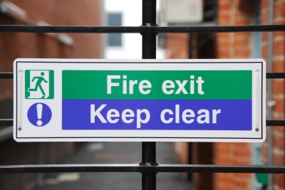
Green – The colour green is used in signs made to direct people and highlight important features of a certain setting. Ranging from emergency exit signs to first aid signs; the colour green is not as intrusive as the colour red or blue, so it has the ability to blend in well whilst still being instantly recognizable in a time of need. Signs using green are usually rectangular or square with white images/text on green background; green should cover a minimum of 50% of the sign.
Psychology of Colours
Colour psychology and the connotations associated with colour play an essential role in the success of our safety signs and signals. Every colour carries its own meaning and each one evokes a different reaction from us as humans. Red is the most powerful and boldest of all colours; demanding attention and action. It gives the impression of heat, anger, passion and dignity; the colour red promotes excitement and signifies danger, making it instantly recognizable. This explains why we use red exclusively for emergency signals or hazardous behaviour.
Blue is the second most powerful colour and is associated with wisdom and strength. There are very few negative connotations attached to the colour blue and as such, is regarded as being the most politically correct and neutral colour. Its association with intelligence perhaps suggests why we use it for instructional signage displaying mandatory information.
Yellow is the most visible colour and the first that the human eye will notice. Lively, stimulating and vibrant, the colour yellow draws our attention. This is why we use yellow in road signs and hazard warnings as the colour makes them hard to miss!
Green is the universal colour for nature and represents freedom and peace. This is perhaps one reason we use green to highlight emergency exits and first aid kits as they represent liberty and healing. It is also widely believed that the “white text on green background” combination is the easiest to read and recognize.
Legal Duties and Obligations around Signs and Signals
According to the Health and Safety (Safety Signs and Signals) Regulations 1996, employers must provide and present specific safety signals in any instances of risk that have not been signaled, controlled or avoided by other means ( such as engineering controls). If the employment of a sign will not remove or reduce the potential risk or if the risk is insignificant, it is not necessary to provide a sign. However, if ever in doubt, it is better to be safe than sorry. These regulations also come with specific requirements for the colour, shape and pattern of safety signals. All signs must contain a symbol or image and must be of the appropriate colour to suit the intended purpose. Text can be used to support images, but signs should never depict text only. All signage must be well maintained and in good condition; whilst employees must be made aware of what each sign means and the necessary actions to undertake in emergencies.
Featured images:
- Image by Smart Photo Stock
Ian Steele is currently studying psychology on the side of being an editorial coordinator at Apptape. Ian believes that colour plays an extremely important role in how we understand and perceive everything in life; from the colour of our signage right through to the colours we choose to dress ourselves in.

Customize Pins in Different Colors
Does your design have significant text? You’ll want your colored text to stand out from the rest of your design at a glance. Does your pin have the colors of your flag or organization badge? To give their custom pin badges the look they want, you can experiment with different shades. With just a little knowledge of color theory and a little imagination, color can be used effectively to express individuality and personal creativity in your custom pin designs. Make your logo pop and shine with free professional art help. Custom pin in different colors is not just an aesthetic choice, it can create an emotional connection with your audience, order now.
Image courtesy of FreeDigitalPhotos.net
