
When it comes to marketing, few things are as critical as the color selection used. Solid and effective color choices can lead to stronger brand messaging, greater consumer engagement and motivate your customers to take action. The detrimental effects of poor color choices, however, can have significant negative impacts on your brand. Color choice can mean the difference between retaining prospective clients or turning them away searching for viable alternatives with the most aesthetically pleasing brand imagery that is more conducive to their sensibilities and confidence.
Since color is so pivotal in the message your brand broadcasts, you can’t afford to get the combination wrong. To make the optimal decision for your brand in terms of color, it is essential to understand the psychology between color perception and emotional communication. In this piece, we will explore the power of color to influence your customers, the current color trends on the market, perhaps most relevantly, how to choose the right color palette to be maximally effective for your particular business.
Because the science and art form that is branding can be a complex matter with many considerations, the best approach to designing the optimal brand is to work with a professional branding agency. They will have the knowledge, skill, and expertise to formulate a brand design that effectively communicates your brand’s message and win over the loyalty and trust of new customers while conforming to all of the contemporary trends. Make sure that you read more about the best design agencies and find one that aligns with your vision for your brand.
While you will not be performing the actual design, you must grasp the conceptual power of color to be a knowledgeable participant in the design process that your branding agency of choice will engage in. After all, it is your brand that they will be crafting. With that in mind, let’s dive into a more in-depth look at the psychology of color.
What Colors “Say”
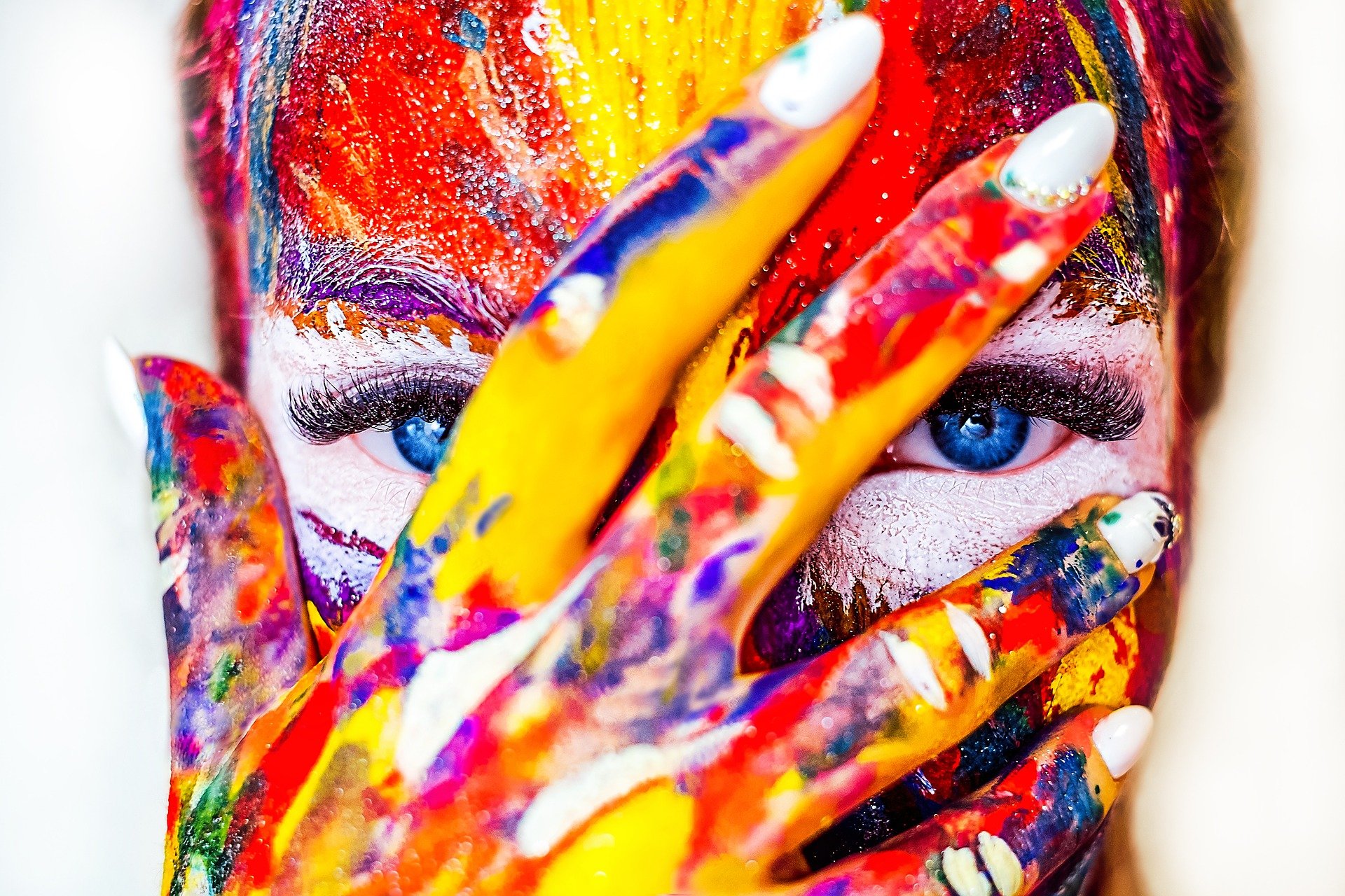
Every color choice communicates something different about your personality, yourself, and your business. If your brand’s color palette is based around red and orange hues, it will display a dramatically different message than one adorned with green and blue ones. If you do not have a good understanding of what colors “say” about you and your brand, you may fail to send the message you want, or worse, send one contrary to what you intend.
Interpretation of colors varies from person to person. People get different messages from colors based partly on evolutionary factors and partly on cultural conditioning. Personal preference and perception are the other significant aspects of color interpretation. If you like the color blue, the message it sends will be positive due to your personal preference. However, there are many commonalities in general color interpretation for people in general, so using this to your advantage can help you construct the best type of branding communication.
Here is how the general public generally perceives the most common colors:
- Red: Exciting, loud, passionate, modern, vocal, angry
- Yellow: Friendly, happy, delightful, full of cheer, affordable
- Orange: Youthful, playful, refreshing
- Blue: Stability, calm, trust, dependability, assurance
- Green: Lucrative, environmentally friendly
- Pink: Femininity, youth, playfulness
- Purple: Luxury, royalty, regality
- Brown: Ruggedness toughness, masculinity, seriousness
- Black: Luxurious, modern, importance, sophistication
- Gray: Maturity, seriousness, neutrality
- White: Cleanliness, freshness, neutrality
Knowing the messages communicated by these colors can help you formulate a representation of your brand that effectively and adequately promotes the message that you are interested in broadcasting to consumers. The message you want to send relies heavily on the nature and personality of your brand. It’s no coincidence that retail outlets often utilize red as a significant brand color, as it excites customers into acquiring new things. Financial institutions use blue to signal their brand’s messages as it promotes stability, trust, and dependability, all things that people feel strongly about regarding their finances. Brands with broad appeal or those catering to children’s products typically utilize fun and playful colors that promote the idea of youth and playfulness, including yellow, orange, and pink.
As you can see, understanding the psychology of colors is ultra-important to leveraging it to connect with your consumers in a meaningful way by showcasing your brand’s right message and personality.
Contemporary Color Trends And What They Mean For Your Brand
Color psychology is an essential factor, but it isn’t alone in determining what colors to implement for your brand. Contemporary color trends are another vital component that contribute to the effect of your brand’s color utilization. After all, you want your brand to stay modern and fresh, so while no one is advocating latching on to every passing trend, it is essential to keep one’s finger on the pulse of what is popular in the modern design schemes in terms of colors.
Pink (Practical)
Ever since the Pantone institute chose Rose Quartz as one of the year’s colors, pink has been on the rise in design color popularity. Traditionally associated with femininity, pink has garnered a new feel that embodies a more neutral tone. This “Millennial Pink,” color of a darker shade and a blush tone, has been able to capture appeal on a mass level, transcending both gender and generational lines in its still rising popularity. For those looking for a fresh facelift to their brand’s color scheme, blush-toned pink or salmon color is an excellent modern choice.
Ultra Violet
Another color experiencing a meteoric rise in popularity is a deep shade of purple (violet). It has been an incredibly effective tool to connect with those customers with an edgy side, as Pantone has deemed the violet color to cast off an edgy, daring feel.
Less Is More (Minimalist Tone)
Many brands are adopting the Scandinavian set of design principles. These principles are all about packing more into less. In the case of design colors, brands are going for the no-frills, minimalist approach to brand design. More neutral tones and muted colors highlight this trend. Dull hues for blue and gray overtones are particularly impactful in such a color scheme.
The Right Color Palette Choice
Now that you are familiar with contemporary color trends and informed on the general psychology of color, you can start choosing the right color palette for your brand. But how exactly do you choose correctly? Let’s take the scientific approach here and base your decision on a simple formula:
Base + Accented + Neutral = Color Palette
Any palette for a brand requires the three colors above: base, accent, and neutral. While using additional colors is not out of the question, most brands prefer to stick to that vital triad, at least from the start. Remember to take your time and think through your color choices since this is arguably the most critical aspect of your brand’s representation.
Once you are armed with the knowledge and understanding of color psychology, contemporary trends, and best branding applications for colors, you are well on your way to establishing your brand as a successful marketing tool. With all this in mind, it’s time to start giving honest thought to your brand’s aim to communicate to consumers and apply your newly acquired color knowledge to your brand design to achieve a successful result.
When you have decided, run your ideas by your branding agency of choice to get their professional take on your opinions. Once you have clarified your stances, it’s time to move toward developing the perfect design concept for your business.
